
The Future of Air Travel: How OOK.es Disrupts Aviation
In the hyper-competitive world of aviation, where brands like Iberia and Vueling have long held the throne, a new challenger is emerging on the horizon—not just with a new fleet, but with a brand identity built for the 2026 digital economy.
Enter OOK.es.
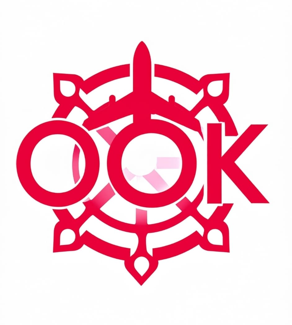
Visual Concept: The "Double O" Turbine Identity
A three-letter domain is more than just a web address; it is a premium digital asset. As we navigate a landscape where mobile bookings account for over 70% of all flight reservations, the brevity, symmetry, and "brandability" of OOK.es make it the perfect launchpad for a next-generation airline.
1. The Visual Identity: Designed for the Skies
The name OOK is a graphic designer’s dream. The double "O" creates a natural symmetry that mimics the core elements of aviation:
- The Turbines: Imagine two bold circles on the wings of a modern jet.
- The Windows: A literal view into the traveler's experience.
- The Landing Gear: Representing stability and precision.
On an airplane tail, a bold, vertical OOK would be instantly recognizable from airport terminals or ground level. In an era of "Instagrammable" travel, a sleek, three-letter brand carries a modern, "Luxury-Lite" aesthetic that appeals to Gen Z and Millennial travelers who shun the "old-world" baggage of legacy carriers.
2. The "Double OK" Experience
In both Spanish and English, "OK" is the universal symbol for approval and ease. OOK takes this a step further, phonetically implying a "Double OK" experience.
For a Next-Gen Low-Cost Carrier (LCC) or an Electric Regional Airline, this signals a superior, hassle-free journey. It promises the customer that despite the competitive pricing, the service is more than just "fine"—it is exceptional.
3. SEO in 2026: From Keywords to Entities
The days of "churn-and-burn" domains like vuelos-baratos-espana.es are fading. Modern search engines and AI-driven platforms (like Gemini and Perplexity) now prioritize Brand Entities over keyword-stuffed URLs.
The Mobile Advantage
Typing "OOK.es" into a smartphone is frictionless. It eliminates the typos and frustration associated with long, hyphenated domain names.
- Trust Signals: A 3-letter domain suggests significant capital and long-term intent. Google’s algorithms treat these as "entities" in the Knowledge Graph, rather than mere affiliate sites.
- The .es Advantage: As a ccTLD, .es provides immediate local authority in Spain. It tells the user and the search engine: "This is the native choice for the Mediterranean Gateway."
4. Scaling Globally: Beyond the Spanish Border
While OOK.es is rooted in Spain, its ambitions are global. By utilizing Hreflang Tags, the brand can seamlessly expand into the UK and USA markets.
| Market | Strategy | Perception |
|---|---|---|
| Spain | ook.es | The "Native" high-trust choice for local travel. |
| UK / USA | ook.es/en/ | The "Specialist" expert for Mediterranean and European travel. |
This structure allows the company to maintain its Spanish heritage—a major selling point for tourism—while appearing as a professional, localized option for English-speaking travelers.
The Verdict for Investors
If a venture capital group or a visionary billionaire were to launch a transport disruptor today, OOK.es would be at the top of the list. It is short, punchy, and carries zero "legacy" baggage. It isn't just a website; it’s a high-visibility, premium asset that is currently undervalued in a world where .com equivalents cost millions.
OOK.es isn't just an airline name. It’s the sound of a frictionless future.
Ready to launch this airline brand?
This premium 3-letter asset is available for immediate acquisition.