
The E-Commerce Renaissance: OOK.es and Digital Craftsmanship
In a digital ecosystem saturated by impersonal giants like Amazon or Temu, the 2026 consumer seeks something different: authenticity and origin. To compete, the new local commerce needs a brand that functions as a global seal of guarantee.
Enter OOK.es: Perfect for a marketplace of local artisans with global ambition.
Visual Concept: The "Origin OK" Seal on Packaging
A three-letter domain is the ultimate storefront. While 80% of impulse buys happen on social media (Instagram/TikTok), the brevity of OOK.es allows the brand to be stamped on clothing tags, ceramics, or jewelry without taking up visual space, acting as a certificate of excellence.
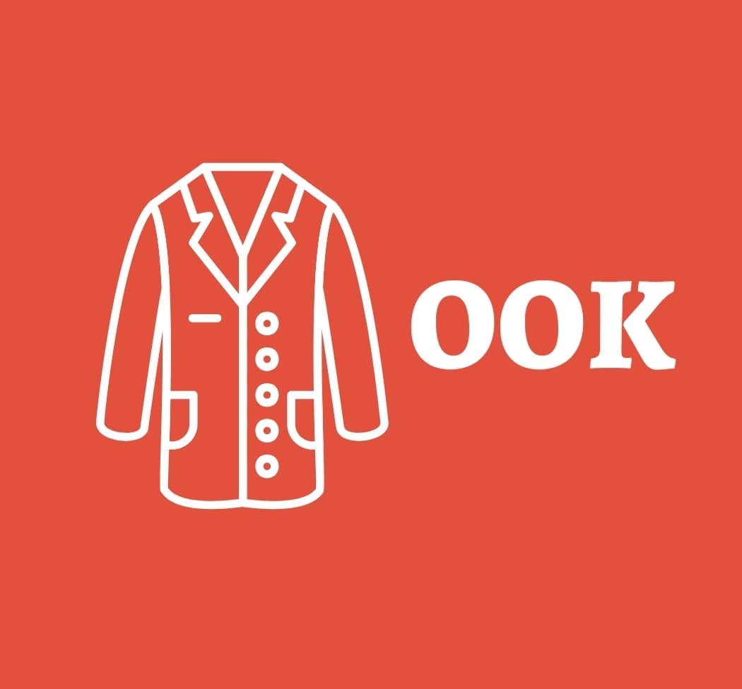
1. Visual Identity: The Human Touch
For a brand designer, OOK is pure geometry applied to the physical product. The symmetry of the letters evokes the artisan's daily objects:
- Buttons or Rings: The double "O" represents handmade fashion and jewelry.
- The Gaze (Lenses): Symbolizing attention to detail and expert product curation.
- The Cycle: Represents the circular economy and the sustainability of local commerce.
Imagine a recycled cardboard shipping box with a simple, massive "OOK" stamped in black. It’s minimalist, "Eco-Chic," and screams modern sophistication. It turns "unboxing" into an accessible luxury experience.
2. The "Double OK" Promise
In e-commerce, trust is everything. The name OOK functions as a psychological wordplay: it implies the product has passed a double quality filter.
For a Spanish Creator Marketplace, this means: "Origin OK, Quality OK." It promises the buyer they aren't getting mass-produced trinkets, but verified unique pieces. It is the antithesis of "fast fashion."
3. SEO and the Era of "Social Commerce"
Long domains like best-artisanal-gifts.es are relics of the past. In 2026, successful brands are short, memorable "Entities" easily found on Google and social media.
Mobile Frictionless
Typing "OOK.es" one-handed on a mobile is instant. It reduces friction between seeing a product on Instagram and finalizing the purchase on the web.
- Brand Authority: A 3-letter domain positions the marketplace at the level of Zara or Mango in the consumer's mind, not as a hobbyist craft blog.
- The .es Factor: Signals "Designed in Spain." An invaluable value-add for international customers who value the country brand.
4. From Local to Global
While OOK.es evokes the closeness of local commerce, it is technically ready to export Spanish talent to the world (UK, USA, Germany) via an international structure.
| Market | Strategy | Customer Perception |
|---|---|---|
| Spain | ook.es | Support for local commerce and nearby artisans. |
| International | ook.es/en/ | Exclusive European design boutique ("Spanish Craft"). |
This duality allows selling Andalusian ceramics or Ubrique leather to customers in New York under an umbrella brand that inspires cosmopolitan trust and regional authenticity.
The Verdict for Investors
If you are launching the next platform connecting creators with buyers, you need a name that is iconic from day one. OOK.es has no language barriers, is symmetrical, and memorable. In a noisy digital world, brevity is the ultimate luxury.
OOK.es: Where local craftsmanship finds its global stage.
Ready to build this Marketplace?
This premium digital asset is available to transform online commerce.